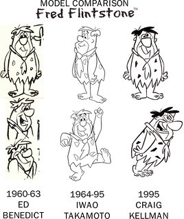
Every famous cartoon character, from Mickey Mouse to Bugs Bunny, has been redesigned and reimagined many times over the decades, and the classic characters of Hanna-Barbera are no exception. However, few have had as radical and large-scale redesign as their characters went through in the mid-90s. And for that, you can thank Craig Kellman.
Craig Kellman's name might not sound familiar, but his portfolio definitely does. He's been an industry veteran since the 90's, having worked for everyone from Disney to Dreamworks. In the middle of that decade, he began working for Hanna-Barbera, joining the likes of everyone from Genndy Tartakovsky to Craig McCracken. To Kellman, the experience was something akin to a dream come true, as he was a big fan of the studio and its characters. To be more specific, he was a big fan of how the characters originally looked.
Like any character in animation, the designs of Fred, Yogi, and the rest weren't set in stone when they were first created. The initial designs were a bit blocker, but over time, the characters became more and more homogenized. In some ways, they lost their uniqueness, in an effort to have them conform to one particular style. Kellman wanted to bring back a sense of individuality to the characters, and Fred Seibert, who ran HB at the time, was happy to give him the chance to do just that. He gave him the order to redraw everything for The Flintstones, and Kellman was off!
These redesigns first started to appear in 1995, in conjunction with The Flintstones' 35th anniversary. They were featured heavily on merchandise from around that time, from picture books to Taco Bell tie-ins, and pretty much everything in between! Look below for a small sample of the redesigns as featured in the 35th-anniversary merch.
However, it wasn't the 35th anniversary that most people associate these redesigns with. No, when the topic of Kellman's interpretation of The Flintstones comes up, most think of the 2001 Cartoon Network special, Flintstones: On The Rocks. A TV movie that aired only once, this special was done by much of the Dexter's Laboratory team. Chris Savino, the main driving force behind the project, really liked Kellman's take on the characters and elected to use them here.
Many believe the designs were created for this special and were never seen again, but just as they had been used in merchandise years earlier, Kellman's Flintstones designs continued to pop up in media over the following years. In fact, the designs are still used to this day! While most modern products tend to use the classic looks, it isn't uncommon to see T-shirts or Flintstones Vitamin packages featuring these versions of the character. Here's a T-shirt you can buy right now on Amazon as proof of that. While they aren't as recognizable as the classic counterparts, I must say that it's really cool that Kellman's take on the stone-age family continues to be used in merchandise, nearly thirty years after their inception.
So, whatever happened to these redesigns? Why did we rarely see anything featuring them? Quite frankly, I think the answer is simple. Characters like Top Cat and Quick Draw McGraw don't have the same value in the public eye as The Flintstones do, so on the rare chances we do get media and merchandise with those characters, it makes sense they would use the classic interpretations that most are familiar with. For what it's worth, the same team that did the On The Rocks TV special storyboarded an entire special focusing on Quick Draw, which sadly got scrapped following the tepid reaction to the former. Perhaps that would have featured Kellman's designs as well? Aside from that, however, the designs of the other HB characters seem to be little more than a footnote in their histories. But for those of us who are fans of these characters and especially their earlier days, these designs will forever hold a special place in our hearts. As far as I'm concerned, none of the later takes on the characters even come close to Kellman's work. They were the perfect blend of old and new, and it's a real shame we don't see more of them.


I know it's easier to mess around with established characters than to come up with new ones, but can someone at least try?
ReplyDeleteHave no idea why so many seem to vehemently loathe these--I suppose they prefer the dull and clunky Seventies/Eighties depictions instead. Nothing takes away appeal like giving a character designed to be flat fake roundness. Sure worked for Rocky and Bullwinkle.
ReplyDeleteI've always loved Kellman's work (that Dino art is the funniest I've ever laughed at that character). I assume the reactions are because they come off as too extreme of a change and lack the simple charm of the previous ones. These designs are basically HB mixed with UPA (as many of CN's early in-house work were).
DeleteThe R & B redeigns are very off. Everyone looks so "plush toy ready" that they come off as cute rather than offbeat and subversive (Boris & Natasha don't even come off as threatening).
I definitely see where people who dislike these designs are coming from, but I personally feel like they keep enough of the simplicity from the original designs while still feeling fresh. Some of the HB redesigns post-Kellman though I would argue were definitely extreme, like Chris Battle's redesigns for the "Yabba Dabba Dinosaurs" series from a few years back. No offense to Battle, who is an exceptional artist, they just weren't for me.
Delete